Filter Bars
Filter bars appear on most pages, below the page’s title. Only the filters that are applicable to the current page are shown.
When you change/apply a filter, it affects every element on the page: tiles, tables, and charts.
On This Page
Page-Level Time Range Filter
Use the Time Range filter to select either relative or specific time ranges for data displays for the current dashboard page. This time is only for the current page, and in effect only as long as the page is active. After you navigate to a different page, or even reload the same page, the time in the time range filter returns to the global dashboard time—the time zone that you set from the dashboard’s Settings icon () in the “top-nav” navigation.
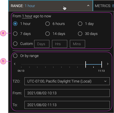
Intervals (ⓐ) such as 1 hour, 1 day, 30 days, and Custom are relative to the current time. If you save the URL for a page with a time interval, subsequent visits mean that the displayed times change relative to the new current time. To save a page’s URL for a specific time range, use the Or by range options (ⓑ).
For related information, see Dashboard Time for Display and Input.
Metrics Filter
Use the Metrics filter bar to select which metrics to show in a table or charts page. The availability of a given metric depends on many factors in your environment: cluster type (YARN or Kubernetes), Pepperdata products (Kafka metrics are specific to Streaming Spotlight), and so on.
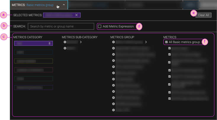
| ⓐ | Selected Metrics. Shows which metrics groups or individual metrics you've chosen. After you make your selections, click Apply to close the metrics filter form and to update the charts display. |
| ⓑ | Search. Enter all or part of a metric or metrics group name, and select the metrics you want from the resultant Metrics column. |
| ⓒ | Metrics. Navigate through the metrics tree, Metrics Category > Metrics Sub-Category > Metrics Group > Metrics, to list all the metrics that are in a given metrics group. To chart all the metrics in a given metrics group, select the All <group-name> group option at the top of the Metrics list (ⓕ). Or you can select one/more/all metrics individually. |
| ⓓ | Add Metric Expression. Add an expression for a computed metric—a Pepperdata metric to which you add arithmetic operations, such as across series or finding the ratio of two basic metrics. For details, see Compute Customized Metrics. |
| ⓔ | Clear All. Removes all metrics from the Selected Metrics. |
Related Topic
-
The Pepperdata dashboard has a Help page that describes all the metrics that we gather.
To view the list of metrics, their code names (which you might want to use for filtering expressions or when using the Pepperdata REST API), and descriptions, click the dashboard’s Help icon () in the “top-nav” navigation (the upper-right corner), and click Metric Definitions.
Breakdown By Filter
The Breakdown By filter bar is available for every page except the dashboards. You can select breakdown dimensions (such as host, user, application, and, for Kubernetes, Pod) and, optionally, filter those dimensions for given values.
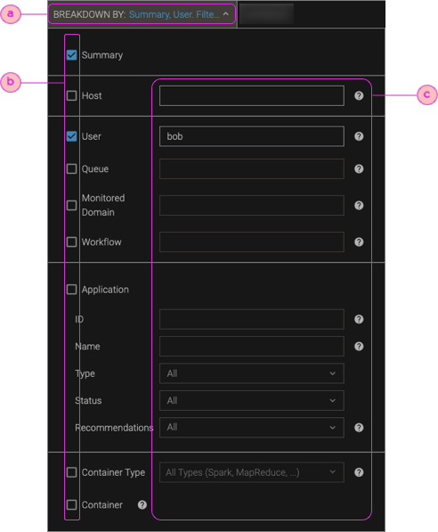
| ⓐ | Name. For pages such as Charts and Custom Table, the display name for the filter is Breakdown By. For Spotlight Overview pages that are predefined for a given breakdown dimension (such as Applications Overview for the application breakdown, and for Kubernetes environments, the Pods Overview for the Pod breakdown), the display name is Filter By, and you cannot select additional breakdowns. |
| ⓑ | Show/hide breakdown. On pages where you can break down the data by additional dimensions, select the checkboxes next to the dimensions that you want to show. For details about the hierarchy of breakdowns, see Filter the Charts & Tables by Dimensions: Hosts, Users, Etc.. |
| ⓒ | Breakdown filters. Limit the data shown for a given breakdown to specific names/IDs, regex patterns, or advanced breakdown filter queries. For details about the hierarchy of breakdowns, see Filter the Charts & Tables by Dimensions: Hosts, Users, Etc.. |
Advanced Chart Options Filter
The Advanced chart options filter bar is available on the Charts page. With it you can change the number of series (and which ones) to show in charts, balance series trends vs. data accuracy, show/hide the average of all series, and show/hide the maximum and average values of the series that are not shown.
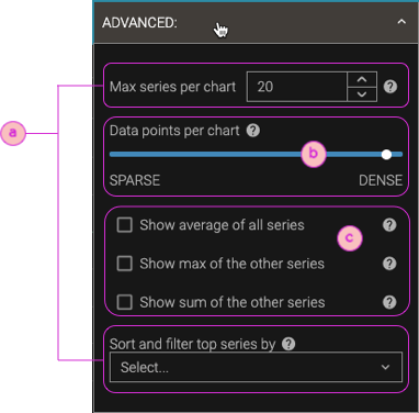
| ⓐ | Number of series (and which ones) to show: Max series per chart. Enter a number from 1 to 100000. Fewer series reduces visual clutter and improves chart rendering performance. For most metrics, the series with the maximum values appear. When series are omitted, the chart shows "by MAX" or "by MIN" to indicate which ones are shown. When there are more series than the number you select, the remaining series are aggregated into average, max, and sum values to provide an overall picture of the activity in the selected timeframe, and by default are shown in the chart's legend, but not the chart itself. To show these aggregates, use the controls shown in callout ⓒ. Sort and filter top series by. Select which series to show when there are more series than the current Max series per chart setting:
|
| ⓑ | Data points per chart. By default, charts are configured to show the most accurate series peak values by including the highest number of data points. But if there is a lot of noise in a chart's data—data points that frequently go up and down—it can be difficult to see the overall trend of the data. This is especially true when there are many series on a chart: if they're all noisy, it's hard to see the signal through the noise. By reducing the number of data points, which smooths the series by down sampling and averaging the points together, it's much easier to focus on series trends. To summarize:
|
| ⓒ | Show aggregates: For all charts, override the default condition of hiding the aggregate series that are calculated when there are more series than the current Max series per chart setting (ⓐ).
(To show any aggregates for just one chart, not all charts, open the chart's legend, navigate to the last page of the data, and select the series that you want.) |