Application Spotlight Overviews & Reports
Application Spotlight shows an application-centric view of everything that’s happening in the cluster, for the selected range and filters.
On This Page
Procedure
-
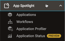
To show an Application Spotlight overview or report, use the “left-nav” menu, expand the App Spotlight sub-menu, and click the overview you want.
The selected overview page appears.
Applications Overview
The Applications Overview highlights which apps are the biggest contributors to excess resource usage and poor cluster performance.
In This Section
Highlight Tiles
The tiles in the top part of the page vary by the environment, as shown in the table.
| Tile | YARN | Kubernetes |
|---|---|---|
| Top CPU-Wasting Apps | ||
| Top CPU-Cost Apps | ||
| Top Memory-Wasting Apps | ||
| Top Memory-Cost Apps | ||
| Top Small-Files Apps | ||
| Top CPU-Requesting Apps | ||
| Top Memory-Requesting Apps | ||
| Top GPU-Allocating Apps | ||
| Top GPU-Wasting Apps |
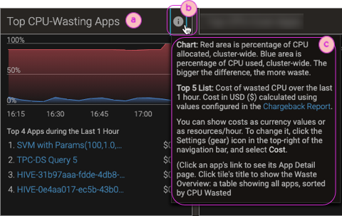
To best understand a tile and what its data represents, mouse over the tooltip icon in the upper-right corner of the tile (info). For example, the tooltip for the Top CPU-Wasting Apps (YARN) tile explains the chart at the top of the page and which apps are in the Top 5 list.
To show a table of all apps (not only the worst offenders), with the same breakdowns as a tile, click the tile’s title.
Matched Apps Table
Below the tiles on the overview page, a table shows apps that match the selected range and filters. Although much of the data is the same for YARN and Kubernetes apps—such as basic app statistics and Pepperdata recommendations—there are a few differences; for example, peak resource usage for YARN, and namespace and GPU information for Kubernetes. To find problem apps, look for the color-highlighted outlier values, or sort by the columns for areas of concern (such as duration and peak memory).
If you apply a long time range filter, it’s common for the table header text to say Showing Top 1000 Items (XXXX Total) By Peak Memory (instead of XXX Items Found).
This happens because Pepperdata limits the query results to 1,000 so as to improve response time and save memory.
If there are more than 1,000 matches, the 1,000 with the largest maximum Peak Memory values are shown.
The XXXX Total represents the number of applications that reported Peak Memory values during the applied time range.
(Kubernetes) For Kubernetes environments, a Spark app’s status encompasses both its behavior (state) and its final status. This two-part approach is needed because sometimes when an app finishes, its Pod terminates before Pepperdata can collect the Pod status phase metric.
-
State: Either “Running” or “Finished”.
-
Status: If the Spark driver Pod terminated before Pepperdata collected the status phase metric, the app’s status appears as “—”; otherwise the status is either “Succeeded” or “Failed”.
Workflows Overview
The Workflows Overview table shows cluster resource consumption (metrics that vary by environment) broken down by workflow (multiple applications for a single purpose, and that are defined by a single workflow Id).
-
In YARN clusters, the Oozie and Hive workflow schedulers automatically assign their own workflow Ids, but to enable Pepperdata workflow-related functionality—chargeback reporting, series breakdowns in charts and tables, and grouping data in the Workflows Overview—you must manually configure a Pepperdata workflow Id; see Pepperdata Workflow Id: YARN Clusters (or the comparable page for a Supervisor version other than the latest).
The Workflows Overview data includes CPU, memory, disk I/O (local and HDFS), and shuffle data.
-
In Kubernetes clusters, workflows launched by Apache Airflow are supported. To configure workflow Ids for Pepperdata monitoring, see Pepperdata Workflow Id: Kubernetes Clusters (or the comparable page for a Supervisor version other than the latest).
The Workflows Overview data includes the workflow DAG (Directed Acyclic Graph), CPU, and memory.
Application Profiler Report
The Pepperdata Application Profiler uses heuristics—rules and triggering/firing thresholds against which Pepperdata compares the actual metrics values for your applications—to generate recommendations. The Application Profiler report shows every instance of a triggered/fired heuristic; each instance is identified as an incident. Incidents are assigned a severity—critical, severe, moderate, or low—depending on the difference between your application’s metrics values and the heuristic’s firing threshold.
There is not a 1:1 correspondence between heuristics and recommendations. For example, a single heuristic might have a low and a high threshold, from which Pepperdata can provide distinct recommendations such as “Too long average task runtime” and “Too short average task runtime”.
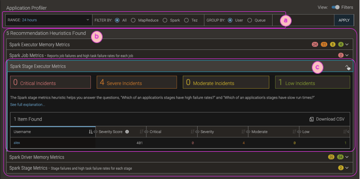
| ⓐ | Filter bars for customizing the time range, filtering by application type (or show all), and/or grouping by user or queue. |
| ⓑ | Heuristics that were triggered/fired for your application. To expand/collapse the details of a heuristic, click anywhere in its row. |
| ⓒ | An expanded heuristic.
|
Application Status Report
The Application Status Report shows how many applications ran during the selected time range, including counts of how many app apps failed, are still running (when you selected the report—the display is static, not dynamically-updated), succeeded, or were killed. Use this report to understand trends in applications’ status over time; for example, are application failures generally clustered around certain times or days.
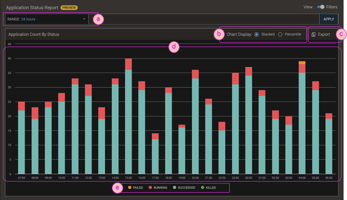
| ⓐ | To select more or fewer applications, use the page-level time range filter. |
| ⓑ | Toggle the chart display between absolute counts (stacked) and percentages. |
| ⓒ | Export the chart as a PNG image, or send an email message (from "reports@pepperdata.com") containing a screenshot of the chart, to up to 50 people. |
| ⓓ | Bar charts of the number or percentage of total apps for each app status: failed, running, succeeded, and killed. To show a popup with time and count/percentage detail numbers, mouse over the bars. |
| ⓔ | Chart legend.
|
Reference: Elements of an Overview Page
Overview pages share a common format for displaying information, and provide similar navigation controls.
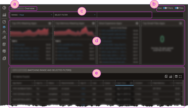
| ⓐ | Title of the overview page. The title matches the name of the currently selected left-nav's Spotlight menu item; for example, selecting App Spotlight > Applications shows the Applications Overview. |
| ⓑ | Hide/show filter bars and, for pages with highlight tiles, hide/show highlight tiles. |
| ⓒ | Filter Bars; for details, see Filter Bars. |
| ⓓ | Highlight tiles (not in all overviews), filtered per the current filter bar settings. |
| ⓔ | Table of items that meet the applied filters' criteria; for details about table elements and filtering, see Tables. |