Interpreting the Capacity Planning Report
The Capacity Planning report provides resource usage data and insight into possible scheduling problems. It shows CPU, memory, I/O (disk bandwidth), and disk (storage) trends over time, across your cluster. You can use this information for future capacity planning and for spotting possible scheduling problems.
On This Page
Display the Capacity Planning Report
Procedure
- From the dashboard navigation bar, click Reports > Capacity Planning. The Capacity Planning report appears.
Planning Resource Needs
Each resource chart in the Capacity Planning report shows the 100th percentile values—effectively the peak values over the full sample size (1 or 7 days)—and five sample-size percentile series ranging from the 95th to 50th percentiles. You can individually hide and show the sample-size percentile series by clearing and selecting their checkboxes (to the right of a chart’s title). Optionally-displayed trend lines—calculated as simple linear regressions—for the ample-size percentiles highlight the overall increase or decrease in a resource’s usage, without the distraction of typical short-term fluctuations.
Each sample-size percentile series represents a given percentile of the sample size. For example, assume:
- sample size is 1 day
- the “p95” chart line shows a value of 65%
This means that for 95% of that day, the resource usage was less than 65% across the cluster. And correspondingly, for 5% of the day, the resource usage was more than 65%.
To best visualize trends, it’s useful to select a time range of 30 days or even many months. With longer time ranges, it’s best to set the sample size to seven days. To reduce the noise, select Show Trend Lines and hide the sample-size percentile series. You can then extrapolate the data to see when it’s likely that you’ll need more of the resource that the chart is showing—CPU, memory, I/O (disk bandwidth), or disk (storage).
Drilling Down to Host-Level Charts
While viewing a Capacity Planning chart, you can drill down to a more detailed, host-level view of an anomalous point or any other day-and-time of interest.
Procedure
-
Display the Capacity Planning report.
-
In the resource usage chart of interest, click any data point, and in the resulting popup, click 24h chart.
Example
As an example, consider the following Total Cpu Used By Percentile chart.
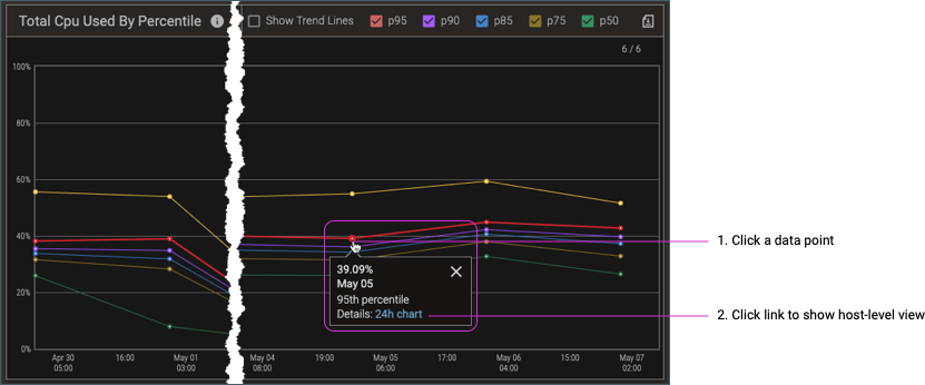
When you click the 24h chart link, the associated summary and host-breakdown charts appear (in the left and right columns, respectively) for the related metrics: total CPU and user CPU.
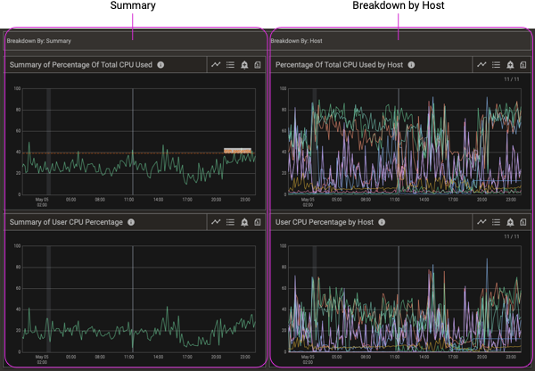
You can further refine the chart settings and explore the relevant cluster and host details. (For details about chart features, see Charts.)
Identifying Scheduling Issues
The typical first step for identifying scheduling issues is to look at a resource chart in the Capacity Planning report. In this discussion, we’ll look at the Total Cpu Used By Percentile chart, but the same principles and process applies to the memory, I/O (disk bandwidth), and disk (storage) resource usage.
Evenly Scheduled Workload
Resource charts where the percentile series are relatively close together, and where usage during the busiest part of the day is not much greater than the median usage (the p50 series) indicate that, for the given resource, the workload is evenly scheduled.
Uneven Workload Schedule
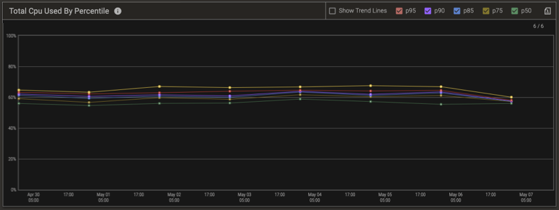
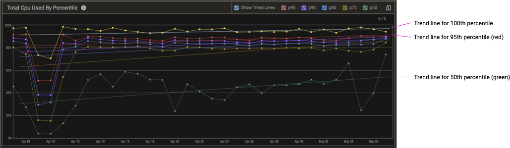
In contrast, following Capacity Planning chart shows a cluster with scheduling issues.
-
The trend line for the 100th percentile shows that throughout the day, over an entire month, the cluster as a whole is is using from 92% to 97% of available CPU, and more alarmingly, trending up, which could indicate a need for more hardware.
-
However, the high CPU usage accounts for only about 5% of each day. (The red trend line for the p95 series is from 82% to 92%, which means that for 95% of the day, the CPU was less than 82%–92%, and therefore the CPU usage was >= 82%–92% for only the remaining 5% of the day.)
-
Looking at the green trend line for the p50 series (the median) shows that for about half of each day, cluster CPU usage is less than 31%–54%.
This means that it’s probable that rescheduling the work to be more evenly distributed throughout the day could eliminate the need for additional hardware.
When you identify a likely scheduling issue, the next step is to confirm it by displaying the Daily Usage Pattern report and looking at the corresponding resource chart—in this case, the Percentage of Total Cpu Used—for the same time period. From the dashboard navigation bar, click Reports > Daily Usage Pattern, and apply the same time range that you used for the Capacity Planning charts.
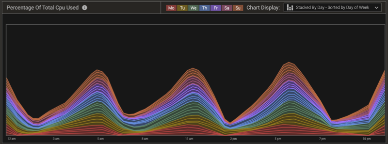
Continuing with our example, the following daily usage chart shows clear patterns of peak CPU usage.
-
What’s notable is that usage is lowest on Mondays, and increases every day thereafter.
-
As well, regardless of the day of the week, there are four six-hour cycles of sharply increasing and then sharply decreasing CPU usage.
This chart confirms that shifting some jobs from peak usage times to low usage times can balance the CPU usage and eliminate the need for additional hardware.