Charts
Charts show time series data for collected metrics. You can zoom in to a particular time period, change the chart’s granularity (the number of series and density of points), breakdown by dimensions (hosts, users, and so on) to chart only those that you’re interested in, and filter the dimensions to selectively hide/show them.
On This Page
- The Charts Interface
- Zoom the Time in Chart Displays
- Filter Breakdowns to Chart Selected Series
- Hide and Show Series in a Chart with the Legend Filter
- Create Custom Dashboards
- Use Advanced Chart Options
- Change Number of Series to Show in a Chart
- Show the Sum of the Others
- Show the Average of All Series
- Balance Series Trends vs. Data Accuracy
The Charts Interface
To display the Charts page, use the left-nav menu, and select Charts.
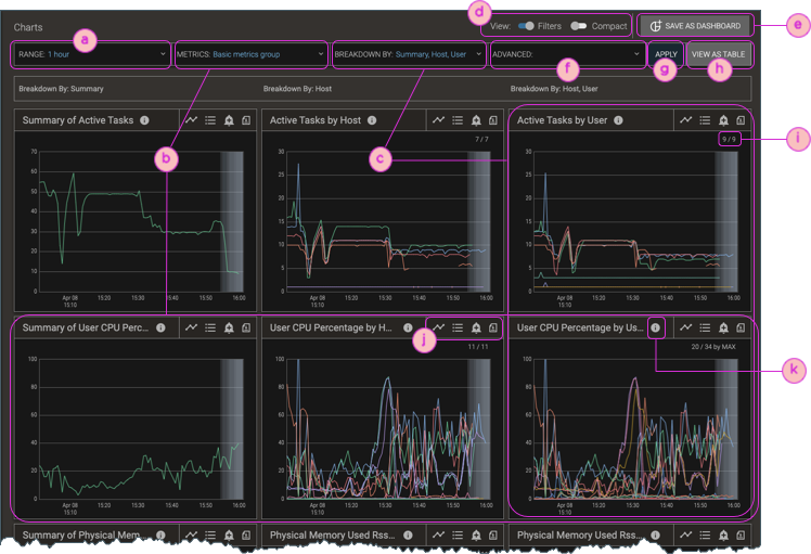
| ⓐ | Range filter for selecting date and time. |
| ⓑ | Metrics filter (for selections) and one row of charts for every selected metric, including those selected as part of a group. |
| ⓒ | Breakdowns filter (to choose dimensions and specify matching criteria; see Filter the Charts & Tables by Dimensions: Hosts, Users, Etc.) and one column of charts per selected breakdown. |
| ⓓ | Toggles for hiding/showing the filter bars and showing either a row of charts per metric (one chart for each selected breakdown) or a compact display (where individual charts show one metric for the lowest-level breakdown). For more about breakdown hierarchy, see Filter the Charts & Tables by Dimensions: Hosts, Users, Etc.. |
| ⓔ | Save the current charts display, with its filters and breakdowns, as a custom dashboard; see Custom Dashboards: Charts You Want to See. |
| ⓕ | Advanced Options filter: choose the number of series to show; emphasize trends or peaks; show sum of others; hide avg. of series; and Compute Customized Metrics. |
| ⓖ | Apply changes made in filters. |
| ⓗ | Change the charts display to a tabular display, with the same data and applied filter settings (except that data appears only for the selected non-Summary breakdowns). |
| ⓘ | Series shown/series total. |
| ⓙ | Controls to change chart type (timeline), show/hide legend (list), create and view associated alarms (add_alert), and export the chart. |
| ⓚ | Tooltip; mouse over the icon for details about what the chart shows. |
Zoom the Time in Chart Displays
You can zoom in on interesting time periods in charts, for example, to see more detail where there’s a spike or where there are many series members. When you zoom the time in one chart, the display refreshes to show the same zoomed time in all the charts.
Procedure
-
Display a chart.
-
Hover your mouse anywhere in the chart, and move it left and right until the vertical line’s associated text shows the time that you want. This is typically the start time.
-
Left-click, hold, and drag the mouse to encompass the time range you want, and release the mouse button.
If you drag to the right, the first click is interpreted as the start time; if you drag to the left, the first click is interpreted as the end time.
When there are multiple charts, all the charts refresh to show the same zoomed time range you selected. As well, if there is a time range filter on the page that you’re viewing, it refreshes to show the same zoomed time range.
Filter Breakdowns to Chart Selected Series
By default, charts show breakdowns for dimensions with the max or min values (according to metric), which highlights the primary contributors. Tables (except the Custom Table) are shown for the dimension breakdown that corresponds to the table’s purpose; for example, broken down by user in the Users Overview. However, it’s often helpful to drill down to specific series of interest by selecting additional breakdowns or by filtering for any breakdown.
For example, after viewing all hosts’ contributions to resource usage of some kind, you might want to focus on particular hosts. You can filter the breakdowns by showing series that match specific names/IDs, that match a regular expression (a regex), or that match an advanced breakdown filter query for status data or a specific metric-value combination.
For detailed information about using the Breakdown By filter (callout ⓒ in the Charts Interface screenshot), see Filter the Charts & Tables by Dimensions: Hosts, Users, Etc..
Hide and Show Series in a Chart with the Legend Filter
Charts typically show so many series for each breakdown (the selections in the filter bar for Breakdown/Filter By, such as hosts and users) that it can be hard to determine which color’s line graph corresponds to a given series. To reduce the number of series on the display, use the Show or hide legend control (list) to show the chart’s legend. From the legend pane, you can then hide or show any given series in the chart.
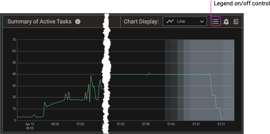
Procedure
-
Display a chart.
-
Click the Show or hide legend control (list).
-
In the resulting list, clear and select the checkboxes to turn a series’ display off and on, respectively.
Create Custom Dashboards
It’s a common scenario that you’ll want to look at charts that are logically related but that have different metrics (chart rows) or series (chart columns). Starting with a given chart and drilling down to its details, or selecting a chart and viewing another chart based on the what you find in the first chart, can be a time-consuming process that becomes frustrating if you’re repeatedly making the same selections and drilldowns. You can eliminate this repetitive process by creating custom dashboards—combinations of charts that you create for any number of any metrics-series data that you want to see.
For detailed procedures, see Custom Dashboards: Charts You Want to See.
Use Advanced Chart Options
The Advanced chart options filter bar is available on the Charts page. With it you can change the number of series (and which ones) to show in charts, balance series trends vs. data accuracy, show/hide the average of all series, and show/hide the maximum and average values of the series that are not shown.
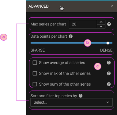
| ⓐ | Number of series (and which ones) to show: Max series per chart. Enter a number from 1 to 100000. Fewer series reduces visual clutter and improves chart rendering performance. For most metrics, the series with the maximum values appear. When series are omitted, the chart shows "by MAX" or "by MIN" to indicate which ones are shown. When there are more series than the number you select, the remaining series are aggregated into average, max, and sum values to provide an overall picture of the activity in the selected timeframe, and by default are shown in the chart's legend, but not the chart itself. To show these aggregates, use the controls shown in callout ⓒ. Sort and filter top series by. Select which series to show when there are more series than the current Max series per chart setting:
|
| ⓑ | Data points per chart. By default, charts are configured to show the most accurate series peak values by including the highest number of data points. But if there is a lot of noise in a chart's data—data points that frequently go up and down—it can be difficult to see the overall trend of the data. This is especially true when there are many series on a chart: if they're all noisy, it's hard to see the signal through the noise. By reducing the number of data points, which smooths the series by down sampling and averaging the points together, it's much easier to focus on series trends. To summarize:
|
| ⓒ | Show aggregates: For all charts, override the default condition of hiding the aggregate series that are calculated when there are more series than the current Max series per chart setting (ⓐ).
(To show any aggregates for just one chart, not all charts, open the chart's legend, navigate to the last page of the data, and select the series that you want.) |
Change Number of Series to Show in a Chart
The series counts are shown in all charts except Summary charts. The counts are displayed as an x/y fraction in the chart’s upper-right corner.
-
The numerator, x, indicates the number of series that are shown in the chart.
-
The denominator, y, indicates that total number of breakdown series that exist.
By default, charts show up to a maximum of 20 series. This default limit:
-
Reduces visual clutter on the charts, which lets you focus on the most significant data points of the metric(s) you’re viewing. For large amounts of information, we recommend using Tables instead of Charts.
-
Reduces browser crashes. If your cluster runs 60,000 applications in a day, and you try to view a metric for a 24-hour period, your browser would need to draw 60,000 lines (series) on a chart. Aside from making it nearly impossible to see data for any given individual job, the attempt would consume unacceptably high amounts of memory and CPU in your browser. Even as few as 2,000 data points could cause significant performance degradation of your browser or even cause it to crash.
If only some of the series are shown—that is, the “y” value of the “x/y” fraction is larger than the “x” value—the applicable metric determines whether the series with the maximum or minimum values are shown, and the result is indicated next to the fraction as “by MAX” or “by MIN”. For most metrics, the charts show the series with the maximum values, but the series with minimum values are shown for a few metrics, such as free memory and disk free.
average_of_all_matched_series, max_of_the_others, and sum_of_the_others aggregate.You can change the maximum number of series shown per chart (the numerator in the x/y fraction in a chart’s upper-right corner). Showing more series gives you a more complete picture, but showing fewer series highlights the edge cases.
Procedure
-
From the Charts page, click the Advanced Chart Options filter, and make your selections.
If you set the Max Series per Chart value too high, it can cause OOM (out of memory) errors on your browser or crash your browser.All the charts refresh to show the appropriate number of series.
Show the Sum of the Others
Charts typically show a sum_of_the_others series when there are more series than the current maximum number to show.
However, for any given chart, if the peak value of the chart’s sum_of_the_others series is more than twice the peak value of any of the other chart’s series that are displayed, the chart does not show the sum_of_the_others series.
In this scenario, hiding the sum_of_the_others series improves the chart’s visualization by reducing the numerical range that must be displayed.
If you want to see the sum_of_the_others series regardless, you can use the Advanced Options to do so.
Procedure
-
From the Charts page, click the Advanced Chart Options filter.
-
Select Show sum of the other series checkbox, and click Apply.
All the charts refresh to show the
sum_of_the_othersseries.If there are fewer series than the current setting for Max series per chart, thesum_of_the_othersseries is not shown, regardless of whether it’s selected in the Advanced Chart Options.
Show the Average of All Series
Charts typically show an average_of_all_matched_series series only when there are more series matched (to the current filter settings for time range and breakdown filters) than the current maximum number to show.
However, you can show this series any time; use the Advanced Chart Options filter to do so.
Procedure
-
From the Charts page, click the Advanced Chart Options filter.
-
Select the Show average of all series checkbox, and click Apply.
All the charts refresh to show the
average_of_all_matched_seriesaggregate series.If there are fewer series than the current setting for Max series per chart, theaverage_of_all_matched_seriesis not shown, regardless of whether it’s selected in the Advanced Chart Options.
Balance Series Trends vs. Data Accuracy
By default, charts are configured to show the most accurate series peak values by including the highest number of data points. But if there is a lot of noise in a chart’s data—data points that frequently go up and down—it can be difficult to see the overall trend of the data. This is especially true when there are many series on a chart: if they’re all noisy, it’s hard to see the signal through the noise. By reducing the number of data points, which smooths the series by down sampling and averaging the points together, it’s much easier to focus on series trends.
Procedure
-
From the Charts page, click the Advanced Chart Options filter.
-
Adjust the Data points per chart slider.
- To emphasize series trends, choose fewer data points per chart (Sparse).
- To emphasize data accuracy, choose more data points per chart (Dense).
-
Click Apply
All the charts refresh to emphasize series trends, data accuracy, or a balance between the two, according to your selected data points per chart.